Project 1 - Out of This World
GitHub Source Code: github.com/corncob567/OutOfThisWorld
Video Demonstration: Out of This World - YouTube
Video Demonstration: Out of This World - YouTube
Data:
The data used for this project came from exoplanetarchive.ipac.caltech.edu/cgi-bin/TblView/nph-tblView?app=ExoTbls&config=PS
This dataset, in my project, is filtered down to 5,243 different exoplanets that have been discovered by NASA since 1992.
The data used for this project came from exoplanetarchive.ipac.caltech.edu/cgi-bin/TblView/nph-tblView?app=ExoTbls&config=PS
This dataset, in my project, is filtered down to 5,243 different exoplanets that have been discovered by NASA since 1992.
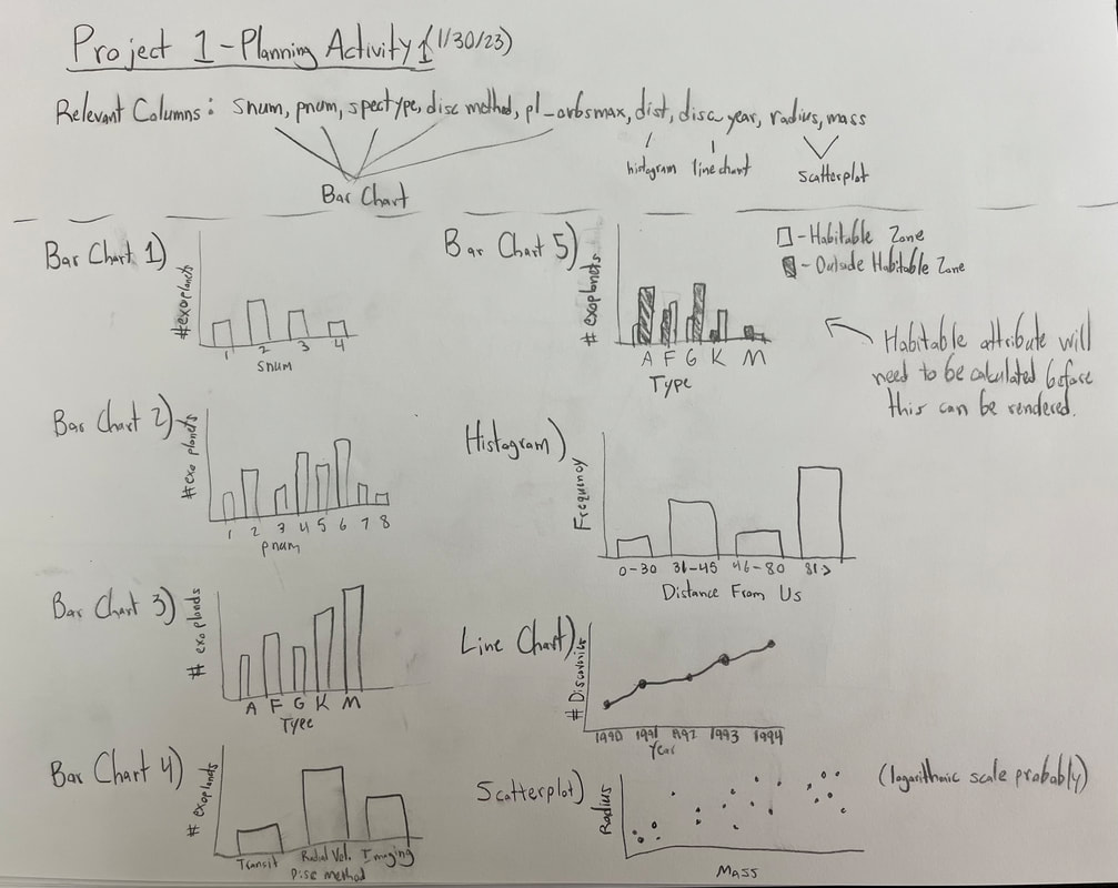
Sketches:
Most of the work for this project was completed without doing any preliminary sketching, but the general idea for all of the visuals was something I wanted to work out before even starting. This sketch is included below.
Most of the work for this project was completed without doing any preliminary sketching, but the general idea for all of the visuals was something I wanted to work out before even starting. This sketch is included below.
Visualization Components:
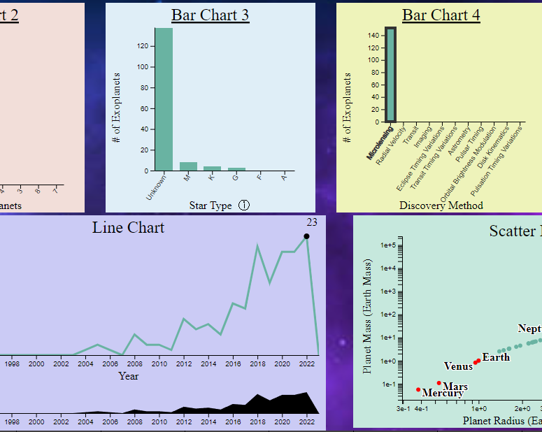
The full view of the GUI consists of 9 visualizations of the exoplanet dataset - 4 bar charts, a stacked bar chart, a histogram, a line chart, a scatter plot, and a table. Additionally, the system browser will also be explored. Each of these components will be described briefly below.
The full view of the GUI consists of 9 visualizations of the exoplanet dataset - 4 bar charts, a stacked bar chart, a histogram, a line chart, a scatter plot, and a table. Additionally, the system browser will also be explored. Each of these components will be described briefly below.
|
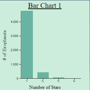
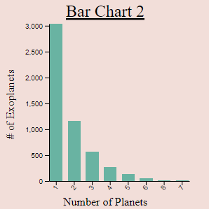
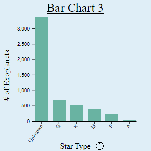
Bar Charts:
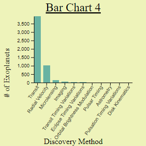
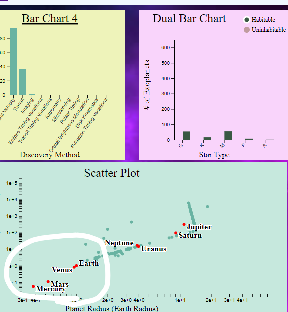
Each bar chart is structured similarly, so I will describe them as a group. The first shows the breakdown of the number of stars in the system of each exoplanet. The second shows how many planets are in the system of each exoplanet. The third shows how many exoplanets exist in systems which have a host star of a particular type (determined by the stars. The fourth shows the method by which each exoplanet was discovered. Each bar chart enabled the user to filter by the property displayed on its X-Axis, simply by clicking the bar above each X-Axis label ort the labels themselves (which is a necessity in the case that no data exists for that column). The user can filter by one, or many properties in the same chart at one time (such as exoplanets that have 1 OR 2 stars). Additionally, filters can be combined between several charts (such as exoplanets with 1 star AND that are type K).
|
|
Stacked Bar Chart:
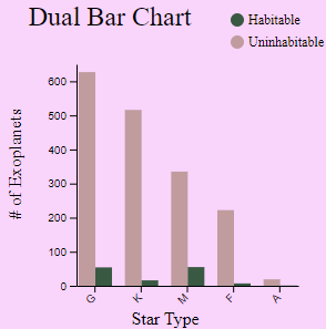
The stacked bar chart displays the number of habitable and uninhabitable exoplanets in systems of each star type. The legend in the top right corner of this visualization allows the user to select either of these types to filter the data of all visualizations to include only exoplanets that meet those criteria. The habitability of an exoplanet is determined within the code by the orbital distance and star type of each exoplanet. |
|
|
Histogram:
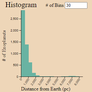
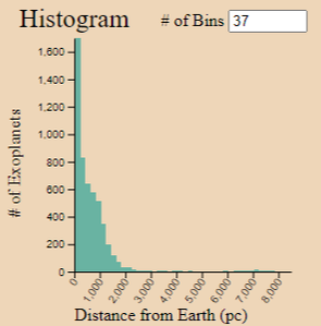
The histogram shows the breakdown of the distances of each exoplanet from Earth, divided into a number of bins determined by the user (30 by default). This is the only visualization in the view that is unable to filter the other views (however, the histogram itself can be filtered). |
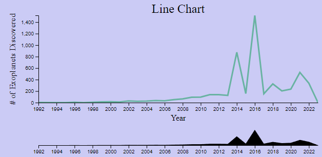
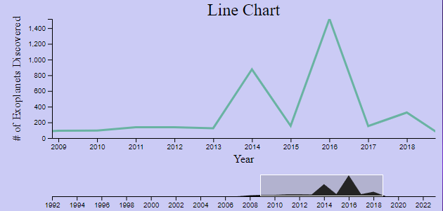
Line Chart:
The line chart shows the number of exoplanets discovered in each year from 1992 to 2023. The brush mechanism beneath it allows the user to highlight a range of years they want to filter all of the data down to. It also acts as a zoom for the line chart itself.
The line chart shows the number of exoplanets discovered in each year from 1992 to 2023. The brush mechanism beneath it allows the user to highlight a range of years they want to filter all of the data down to. It also acts as a zoom for the line chart itself.
|
|
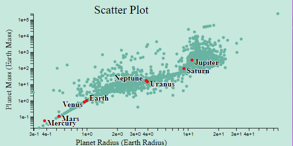
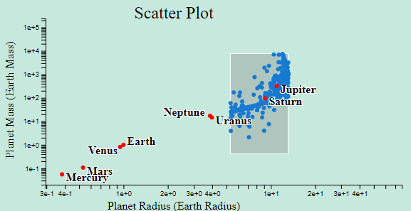
Scatter Plot:
The scatterplot shows each exoplanets radius with respect to its mass on a logarithmic scale. It also includes the planets in our solar system. Brushing over a selection of these points will filter all of the visualizations down to only include those selected points. Additionally, clicking any point on the scatterplot will open the system browser for that exoplanet.
The scatterplot shows each exoplanets radius with respect to its mass on a logarithmic scale. It also includes the planets in our solar system. Brushing over a selection of these points will filter all of the visualizations down to only include those selected points. Additionally, clicking any point on the scatterplot will open the system browser for that exoplanet.
|
|
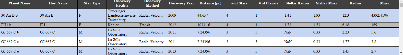
Table:
The table at the bottom of the view shows a simple tabular form of all the non-filtered exoplanets. Selecting any row will open the system browser for the exoplanet represented by that row.
The table at the bottom of the view shows a simple tabular form of all the non-filtered exoplanets. Selecting any row will open the system browser for the exoplanet represented by that row.
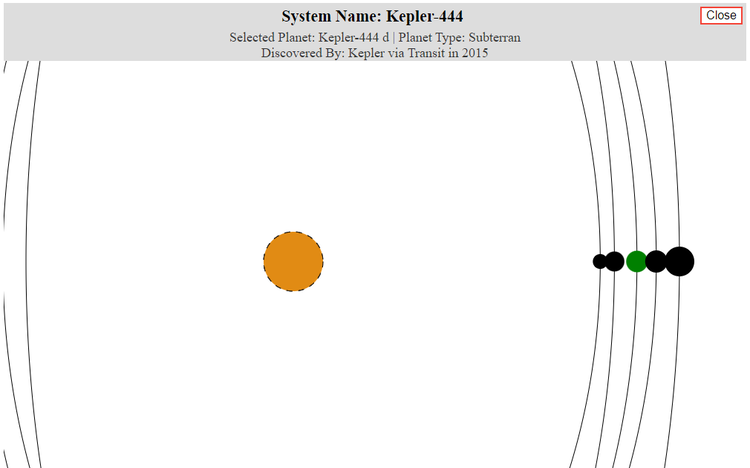
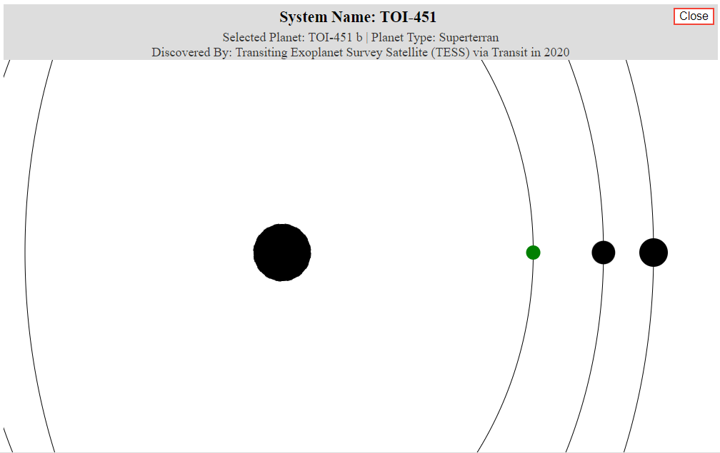
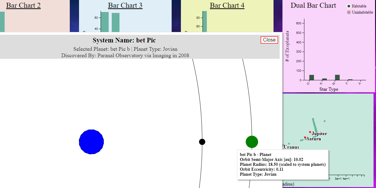
System Browser:
The system browser displays the planetary system for a selected exoplanet from the scatter plot or table. It includes the primary host star, colored according to its star type and the star's radius (unknown star types are black). It also shows the orbital distances and eccentricities of all of its planetary neighbors that orbit the same star. The selected planet is colored differently. Planets that have unknown eccentricities will not have an orbital path shown, and planets without a radius will not have a fill. Otherwise, planets will be sized in reference to each other.
The system browser displays the planetary system for a selected exoplanet from the scatter plot or table. It includes the primary host star, colored according to its star type and the star's radius (unknown star types are black). It also shows the orbital distances and eccentricities of all of its planetary neighbors that orbit the same star. The selected planet is colored differently. Planets that have unknown eccentricities will not have an orbital path shown, and planets without a radius will not have a fill. Otherwise, planets will be sized in reference to each other.
|
|
Discoveries/Findings:
This system of visualizations, coupled with its robust filtering mechanisms, allow users to make unique discoveries about this large array of exoplanet data in a visually understandable way. Below are just some of the more interesting findings I observed.
This system of visualizations, coupled with its robust filtering mechanisms, allow users to make unique discoveries about this large array of exoplanet data in a visually understandable way. Below are just some of the more interesting findings I observed.
|
There is a habitable Jovian planet that has a radius over 18 times larger than Earth's. This means it has 342x more surface area. It would be nice if we could inhabit such a large planet.
|
|
Microlensing must be a fairly modern technology for discovering exoplanets, as it was not even used until 2004, and has been increasing rapidly since then.
No exoplanets have been discovered that are smaller than Earth. I am guessing this because they are simply too hot as they are too close to their host star. This could also imply that our Sun just isn't that hot, which is why Earth is habitable despite being relatively small. |
Process:
The visualizations were created entirely using D3. Styling was done using SCSS. The code is publicly available at github.com/corncob567/OutOfThisWorld. The code was structured into separate classes for each type of visualization - bar, stacked bar, line, histogram, scatter, and bubble (for the system browser). Each of these classes makes use of a global filter function that applies an array of globally assigned filters to all of the data used in each visualization, then calls an update function within each. This causes all of the visualizations to change whenever a filter is added or removed from any chart.
The visualizations were created entirely using D3. Styling was done using SCSS. The code is publicly available at github.com/corncob567/OutOfThisWorld. The code was structured into separate classes for each type of visualization - bar, stacked bar, line, histogram, scatter, and bubble (for the system browser). Each of these classes makes use of a global filter function that applies an array of globally assigned filters to all of the data used in each visualization, then calls an update function within each. This causes all of the visualizations to change whenever a filter is added or removed from any chart.
Future Work:
Thankfully, most of the tasks I set out to complete were accomplished by the end of this development process; however, some things were left undone for future work:
Thankfully, most of the tasks I set out to complete were accomplished by the end of this development process; however, some things were left undone for future work:
- Column sorting on the data table, and toggles between ascending and descending orders on bar charts.
- Smaller, better scaled, system browser display. Currently, the orbits are too large to be contained, and they need to be scaled properly. I spent hours trying to even get it to look decent.
- Multi-brush on line and scatter plots. I think it would be helpful to users if they could select several disjoint regions of these charts for filtering.
- More transitions. I wanted to add fade/movement transitions on the non-bar charts but never really got around to it.
- Dealing with multi-star systems. Currently, I just ignore systems with more than one star in them by only showing one of the system's stars. Ideally, I am able to show all of these stars, scaled in reference to one another, all on the same screen.
- Search feature for data table. I would like to be able to search for a planet by name (or host name) within the data table.
Design Presentation and Critique
Vis Source (Private): create.roblox.com/dashboard/creations/experiences/3973336388/analytics
General Visualization Info: create.roblox.com/docs/production/analytics
General Visualization Info: create.roblox.com/docs/production/analytics
What is the Roblox Creator Dashboard?
The Roblox Creator dashboard is designed to be an easy way for game developers on Roblox to view various statistics about their games, and how well they are performing. This implies the visualization is aimed specifically towards game developers on the Roblox platform. The data itself is derived from stored statistics calculated when players join/leave experiences, how long they stay, how frequently (and when) they return, how they find the experience, and how much money they spend within it. The actual data collection is automated within the Roblox game engine itself (unlike manually entered data), which means it is constantly being updated (non-static). The data itself can be summarized as statistics regarding user acquisition, retention, monetization, and engagement.
The Roblox Creator dashboard is designed to be an easy way for game developers on Roblox to view various statistics about their games, and how well they are performing. This implies the visualization is aimed specifically towards game developers on the Roblox platform. The data itself is derived from stored statistics calculated when players join/leave experiences, how long they stay, how frequently (and when) they return, how they find the experience, and how much money they spend within it. The actual data collection is automated within the Roblox game engine itself (unlike manually entered data), which means it is constantly being updated (non-static). The data itself can be summarized as statistics regarding user acquisition, retention, monetization, and engagement.
What questions do people want to ask about the data provided on the Roblox Creator Dashboard?
Frequently, game developers may have questions about the data stored in the Creator Dashboard. These could include:
Frequently, game developers may have questions about the data stored in the Creator Dashboard. These could include:
- How long do players generally stay in the game before deciding to leave?
- Do players tend to return multiple times after playing the game for the first time?
- How much money has been generated by users playing my game(s)? What items are most profitable?
- What trends can I expect to see for the number of players visiting my game this month?
- How are users discovering my game? How many discover it in this way?
- What is the age range of users playing my game(s)? What devices do they tend to play on?
- How well is my game doing compared to others of the same genre?
What insights can be derived from the Roblox Creator Dashboard? (Effective and Ineffective Design choices)
|
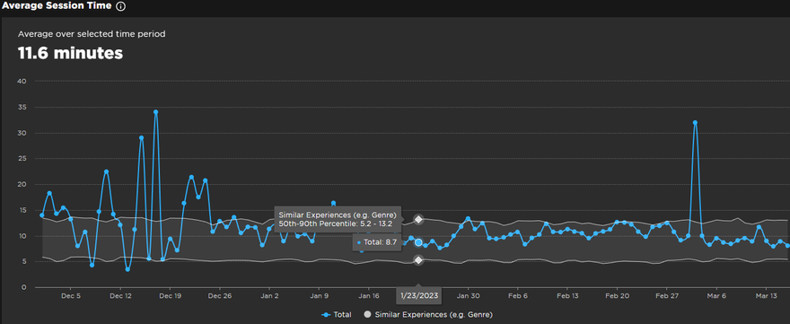
Several graphics are provided to developers to track the popularity of their game, and some of these also allow viewers to see how well their game compares to their competitors of similar genres. The line chart shown here for average session play time also provides bounds representing the same statistic for the 50th to 90th percentile of related games.
|
|
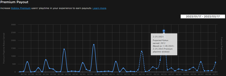
This line chart depicts the amount of virtual currency earned from Premium members playing your game and provides an interpolated estimate of what the future earnings of the game will be over the proceeding weeks (dotted). This is very helpful for developers hoping to look into the future to plan ads or payouts.
|
|
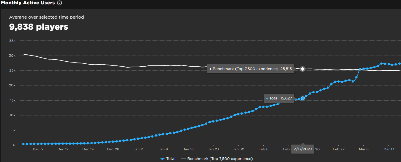
This chart shows the total number of monthly active users your game has over time. It also provides a useful baseline average for the number of monthly active users for the top 7,500 games on the platform. This provides a useful insight to developers wishing to know if they are below or above the average.
|
|
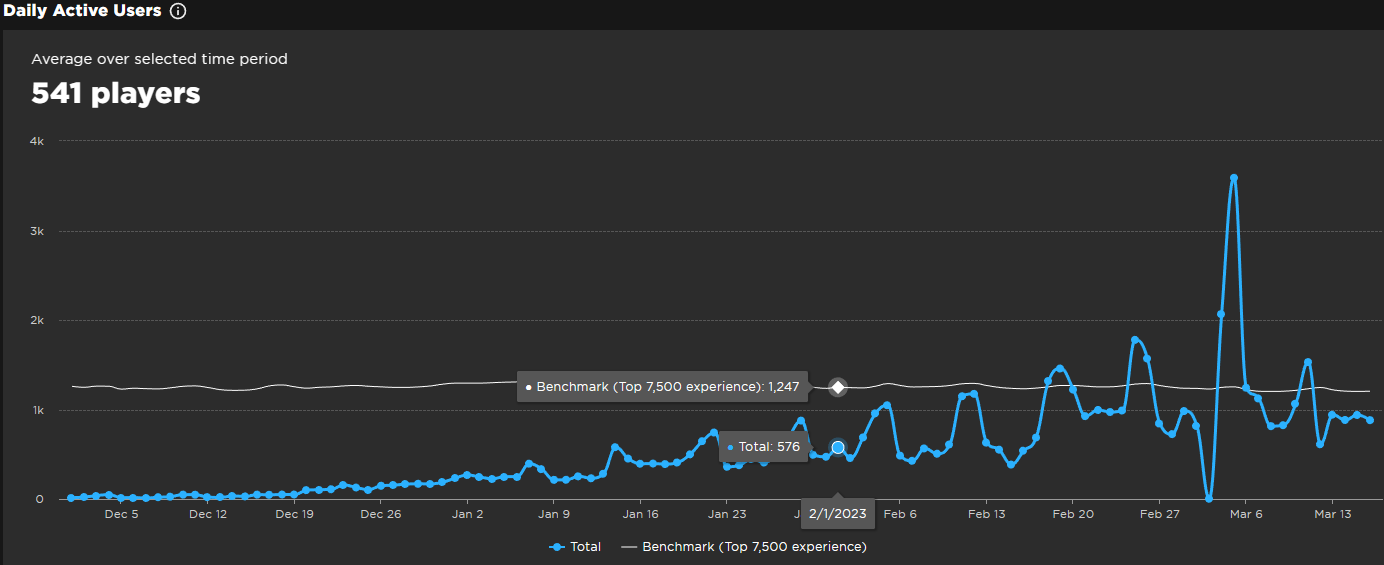
This chart allows for similar insights as the prior visualization in regards to the number of users that access the game on a daily basis. One can notice that weekends tend to be much more popular than week days (note the periodic spikes in play count). I particularly find the dual tooltips effective for comparing a daily total to the benchmark.
|
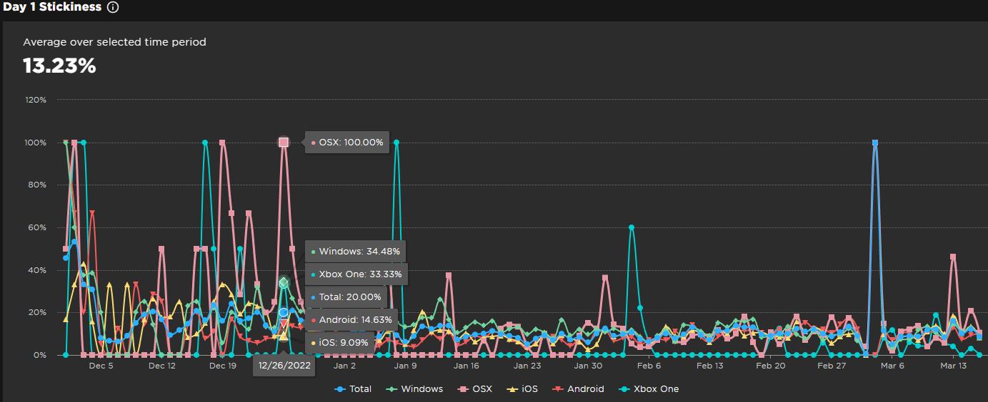
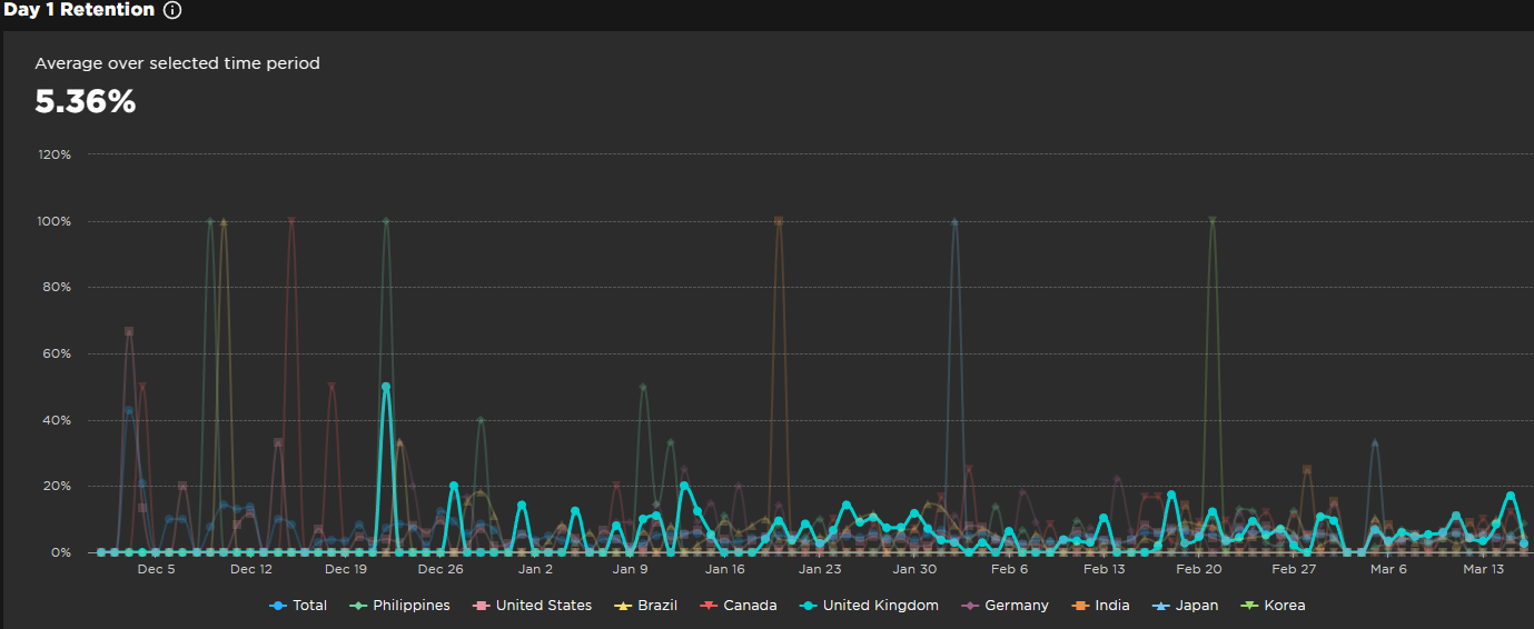
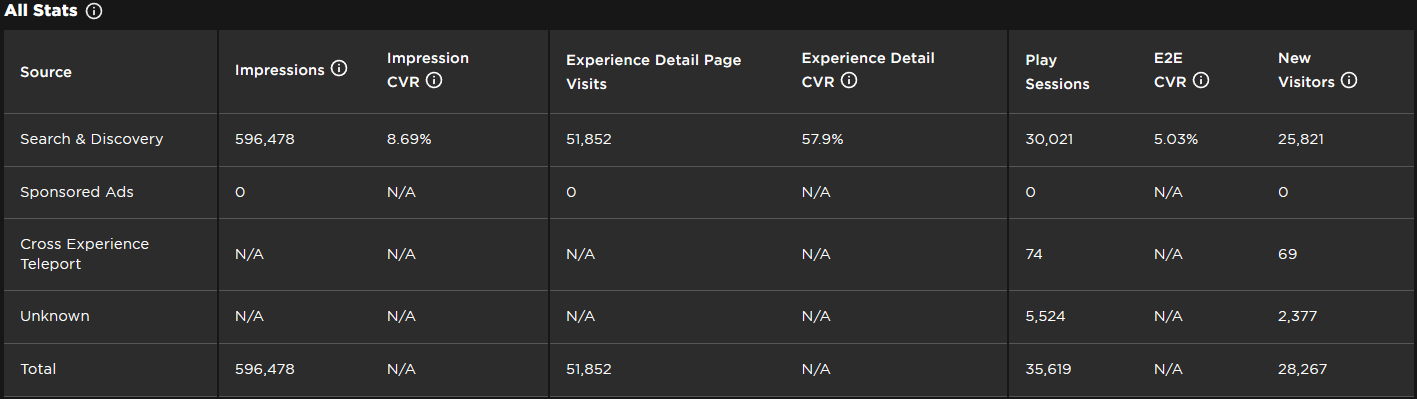
The multi-line chart above allows developers to see the correlations and fluctuations in the percentage of players that return to their games the day after their first time playing. This statistic is provided as a sum over all platforms, but also broken down into each. Clicking the platform names allows users to filter and clear clutter off of the visualization such that they can just see what they want to see. For all of these graphics, it is also easy to filter down to only a specified time frame.
|
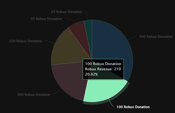
The only pie chart available (likely for good reason) gives a visual representation of the percentage of sales deriving from different in-game product purchases. This could allow developers to get a better understanding of what kinds of products sell at a disproportionate rate compared to others. This chart can be highlight specific products by clicking sections of the graphic, also providing additional information about them.
I think a bar chart with tooltips would ultimately be more effective for purposes of comparison, but visually the pie chart is still appealing. |
|
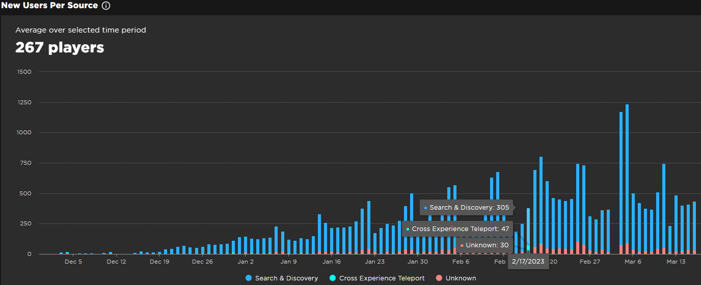
A stacked bar chart showcases the number of new players that join the game from different sources over time. Hovering over each bar provides a tooltip displaying the specific breakdown for that column. I think it would be effective to show the percentages in this tooltip as well, but this is not provided.
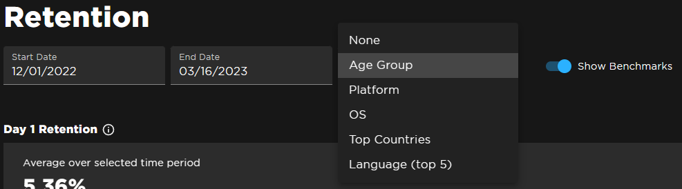
I particularly like the available filters for many of the visualizations on the developer dashboard. As previously mentioned, you can adjust the start and end dates shown. You can also choose whether or not you want the benchmark lines to appear on the visualizations. My favorite feature is that you can choose what attribute your graphics are broken down by (age, platform, OS, country, or language). The multi-line chart shown below depicts a breakdown by top countries. Clicking on one or more particular countries highlights them and causes the others to fade. I think this is a very effective design choice, since I am still able to view all of the data despite having only certain lines selected.
|
The last visualization is simply a table of all of the stats relating to user acquisition. Although I like having the option to view all of my data succinctly in one place, it would be nice if this sort of visualization was provided across all of the visualizations (not just those relating to user acquisition). I also believe it would help if the header row and the bottom row depicting totals were differentiated from the others.
|
What are the limitations of this design? What can't someone do with these visualizations?
Although many questions can be answered using the various visualizations on the Roblox Creator Dashboard, there are still several stats that are simply not provided (or at least, not readily available via the existing graphics). The following are just some questions developers may have that are not answered by the current developer dashboard:
Although many questions can be answered using the various visualizations on the Roblox Creator Dashboard, there are still several stats that are simply not provided (or at least, not readily available via the existing graphics). The following are just some questions developers may have that are not answered by the current developer dashboard:
- What is the total number of hours players spend in the game? Can I view a leaderboard for such things?
- Can I view a specific percentile of the average game of the same genre as mine? (Currently, viewers are restricted to the 50th-90th percentile)
- Can I view differences in counts as percentages rather than sums? (i.e, a 10% increase in popularity vs a 1000 visit increase between months)
Project 3 - Avatar TV Time
Motivation:
The motivation for this project was to be able to uncover unique and interesting information regarding the large amount of dialog in Avatar. We believed the large number of main characters and unique attributes such as bending discipline/native nation/etc, would help contribute to intriguing visualizations about the data. Useful insights about what each character tends to say across the shows runtime may help analyze the series as a whole.
The motivation for this project was to be able to uncover unique and interesting information regarding the large amount of dialog in Avatar. We believed the large number of main characters and unique attributes such as bending discipline/native nation/etc, would help contribute to intriguing visualizations about the data. Useful insights about what each character tends to say across the shows runtime may help analyze the series as a whole.
Data:
Our team sourced the data using this page compiling all the scripts on the Avatar Fandom wiki, creating a custom script to parse all the data. Our scraper file can be viewed here - to summarize, the scraper was written in Python to scrape each transcript on the page previously mentioned. Each page features an html table of the whole script, with the character and what they said, along with extraneous information such as stage instructions. An http request was made to each page to grab the contents of the page body. Each episode transcript was saved into a Pandas Dataframe with season, episode, character, and dialog, added in the order of the transcript.
The data was saved to a csv file containing every dataframe row, viewawble here.
Discoveries/Insights:
Using our visualizations, we were able to discover many insights about the series that we would have never known otherwise.
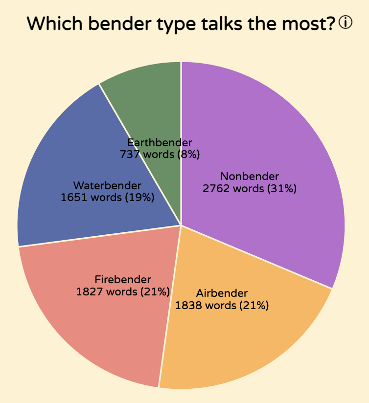
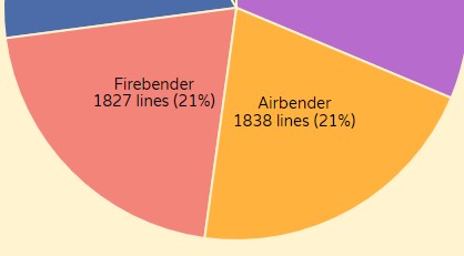
It was very apparent that earthbenders generally had far less lines than any other bending discipline, even if season two - notorious for including notable earthbenders. Also, related to the pie chart, it is worth noting that Aang - the only airbender with a significant proportion of dialog - speaks more lines than all of the main firebenders in the series combined.
Additionally, we noticed that Sokka, although not the main character of the series (Aang), speaks 433 more words than Aang. We assume this is because Sokka tends to elaborate on jokes and plans in often verbose ways, whereas Aang tends to be more direct.
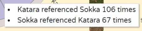
Katara always references other main characters significantly more than other characters reference her. This is especially interesting when looking at the references between her and Aang (who was her love interest throughout the entire series).
Using our visualizations, we were able to discover many insights about the series that we would have never known otherwise.
It was very apparent that earthbenders generally had far less lines than any other bending discipline, even if season two - notorious for including notable earthbenders. Also, related to the pie chart, it is worth noting that Aang - the only airbender with a significant proportion of dialog - speaks more lines than all of the main firebenders in the series combined.
Additionally, we noticed that Sokka, although not the main character of the series (Aang), speaks 433 more words than Aang. We assume this is because Sokka tends to elaborate on jokes and plans in often verbose ways, whereas Aang tends to be more direct.
Katara always references other main characters significantly more than other characters reference her. This is especially interesting when looking at the references between her and Aang (who was her love interest throughout the entire series).
|
|
Process:
The visualizations were created entirely using D3. Styling was done using SCSS. The code is publicly available at github.com/corncob567/Avatar-TV-Time. The code was structured into separate classes for each type of visualization - bar, chord, pie, word cloud, and table.
The visualizations were created entirely using D3. Styling was done using SCSS. The code is publicly available at github.com/corncob567/Avatar-TV-Time. The code was structured into separate classes for each type of visualization - bar, chord, pie, word cloud, and table.
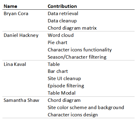
Contributions:
Visualization Components:
The full view of the GUI consists of 9 visualizations of the exoplanet dataset - 4 bar charts, a stacked bar chart, a histogram, a line chart, a scatter plot, and a table. Additionally, the system browser will also be explored. Each of these components will be described briefly below.
The full view of the GUI consists of 9 visualizations of the exoplanet dataset - 4 bar charts, a stacked bar chart, a histogram, a line chart, a scatter plot, and a table. Additionally, the system browser will also be explored. Each of these components will be described briefly below.
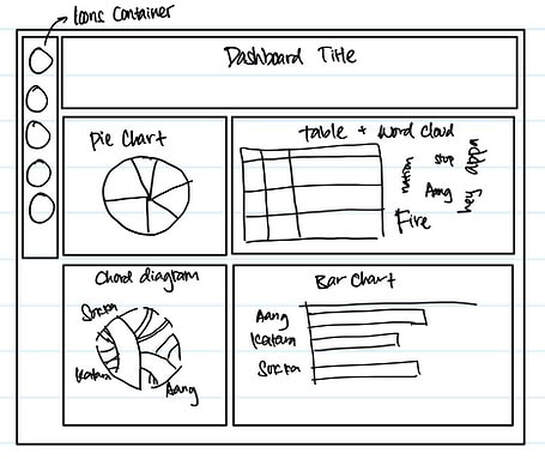
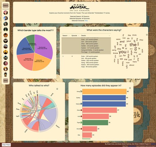
Dashboard Overview:
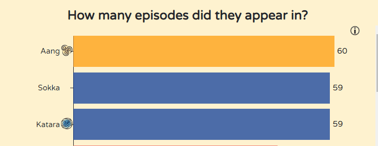
Our page consists of 4 primary visualizations for the data - a pie chart showing the breakdown of lines spoken by the bending discipline of the speaker, a word cloud showing the most spoken words for the given filters, a chord diagram showing the number of times each main character references another main character, and a bar chart showing how many episodes each character has lines in (as well as the number of words each character spoke, shown in tooltip form).
Users are able to filter by character, season, and episode - updating the pie chart, table, and word cloud accordingly. Each of these visualizations will be discussed in the following sections.
|
|
Breakdown by Bending Discipline:
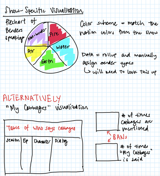
The pie chart shows the percentage and number of lines spoken by characters of each bending discipline. We justified including a figure like this because the proportion of lines spoken by bender type felt like a natural route to take considering the nature of the series. We believed viewers would be interested in a breakdown like this.
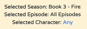
The filters on the sidebar of the screen allow this visualization to change based on the users selection of character, season, and episode.
The pie chart shows the percentage and number of lines spoken by characters of each bending discipline. We justified including a figure like this because the proportion of lines spoken by bender type felt like a natural route to take considering the nature of the series. We believed viewers would be interested in a breakdown like this.
The filters on the sidebar of the screen allow this visualization to change based on the users selection of character, season, and episode.
|

|
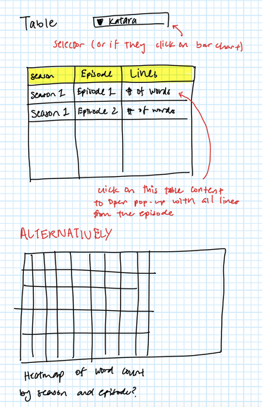
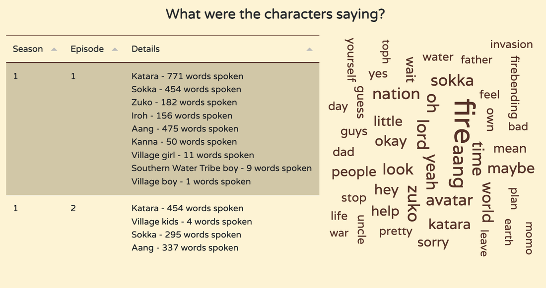
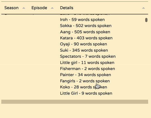
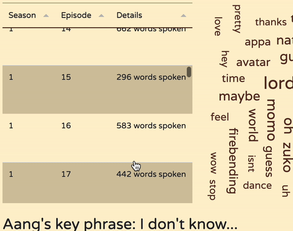
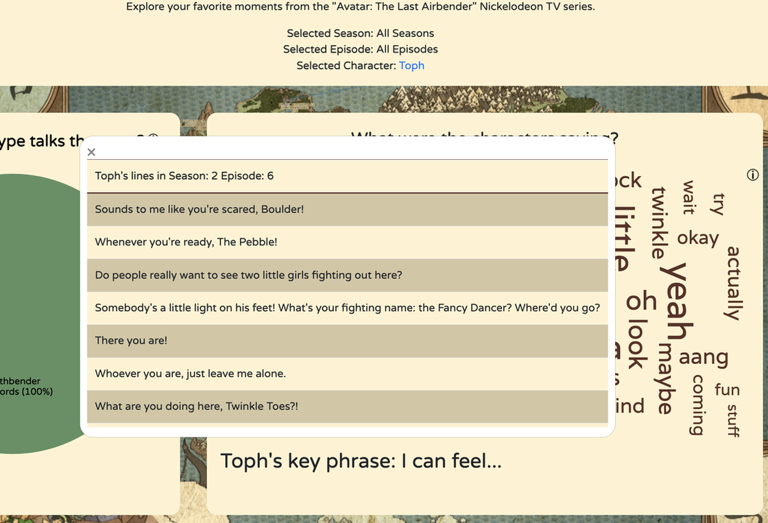
Word Cloud and Table:
The table and word cloud are group together visually to indicate they both help users visualize what characters in the show tend to say. By default, the table shows what characters have lines in every episode. If a character is selected, you can select any row of the table to trigger a modal that displays each line spoken by the selected character for that selected episode. In a similar manner, the word cloud shows the most commonly spoken words given the current filters. For instance, with the default of all seasons, all episodes, the word cloud shows the most common words spoken in the show as a whole - such as "Fire" and "Avatar".
The table and word cloud are group together visually to indicate they both help users visualize what characters in the show tend to say. By default, the table shows what characters have lines in every episode. If a character is selected, you can select any row of the table to trigger a modal that displays each line spoken by the selected character for that selected episode. In a similar manner, the word cloud shows the most commonly spoken words given the current filters. For instance, with the default of all seasons, all episodes, the word cloud shows the most common words spoken in the show as a whole - such as "Fire" and "Avatar".
|
We considered using a heat map to show commonly spoken words as well, but scrapped this idea, as it would require the use of tooltips, where the user could only really see data on one word at a time versus viewing all of them at once.
The table went through several iterations, especially regarding what it would display when no character was selected. We ended up going with the general summary of what characters and how many lines each character has in each episode. The default view of the word cloud features all the words ever said in the whole series. Clicking on a season (and optionally followed by an episode selection), filters out the words to just that season/episode. Stop words and other fillers were removed according to this list. |
|
|
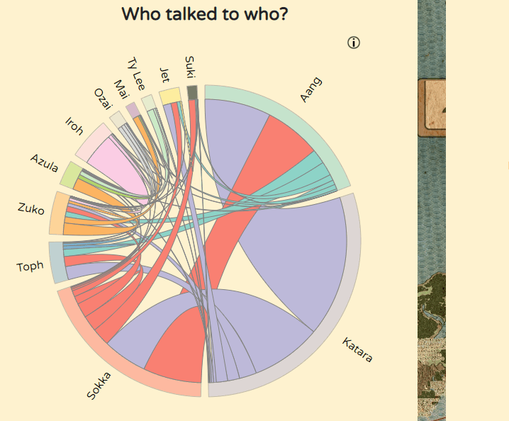
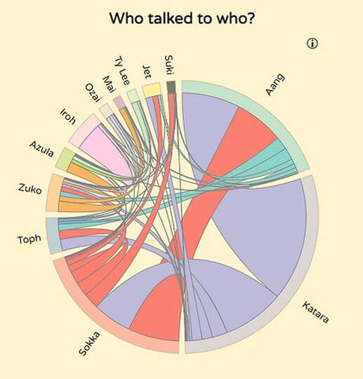
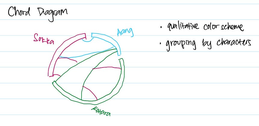
Chord/Reference Diagram:
The chord diagram is static regardless of the filters applied. This is not something we intended, but we were unable to get the chords properly re-rendering when filters were applied. Essentially, it shows how often each of the main characters refers to another main character by name. Hovering over each arc shows a tooltip showing exactly what the number of references comes out to be between those two main characters.
Viewers will notice very strong connections between Aang, Katara, and Sokka, as well as between Zuko and Iroh (who travel together throughout nearly all of the series). We included this visualization because we believe it highlights the strength of relationships or bonds between characters effectively.
|
|
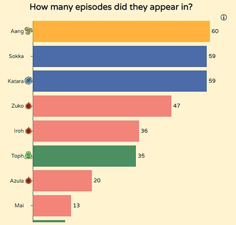
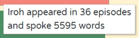
Bar Chart:
The bar chart displays how many episodes each character had at least one line in, as well as their bending discipline icon beside their name and, within a tooltip, how many total words they've spoken in the series.
The bar chart displays how many episodes each character had at least one line in, as well as their bending discipline icon beside their name and, within a tooltip, how many total words they've spoken in the series.
|
|
